
You are not logged in.
#1 2009-09-06 11:16:37
- Taylor McIntyre
- Son of Ivy...
- Posts: 342
Labels?
Purely from a design POV...
I was looking at that Landsend 'Lighthouse' label again this morning & loving it.
Dave Mercer has a really sucky lable.
The Brooks 'Script' label is no good either.
What Ivy labels do you like from a design POV.
I love Andover's label in the back of a Shetland. The new J. Press Shaggy Label is awful when compared to the old ones - Far too crude.
The old OCBD labels in Sero, Brooks, & Press still 'do it' for me.
And then we come to the old Troy label...
Hathaway had a charm which Arrow lacked, unless you bought Arrow's "The Traditionals" range...
The Geoffrey Scott label was a good one too. Ditto Par-Ex, but BD Baggies have always looked cod.
What designs do you like?
#2 2009-09-06 11:59:36
- adam!
- The Future
- Posts: 608
Re: Labels?
The label in my Brooks tab collar shirt - not from a design point of view (though it aint ugly!) - I love it 'cause it excites me!
#3 2009-09-06 13:01:36
- Taylor McIntyre
- Son of Ivy...
- Posts: 342
Re: Labels?
The Crimson Shop label with that big Red crescent 'C'. On their sales receipts the 'C ' was made up of bricks like a slice of wall.
The Harris Tweed Orb Mark label has to be a classic too.
And then there's the LL Bean Anti-Label... Another classic.
#4 2009-09-06 13:03:38
- Staceyboy
- Ivy Archivist

- Posts: 936
Re: Labels?
I love the old "Big Ben" London Fog label design. I couldn't stop looking at it when I first bought a 60's LF mac some twenty odd years ago. The design still appeals to me. Was great to see the chaps travel to Baltimore to tout for business at the London Fog HQ in episode 2 of the new "Mad Men" series.
Staceyboy
http://thetownoutside.tumblr.com
#7 2009-09-06 13:31:47
- Moose Maclennan
- Ivy Inspiration
- From: Hernando's Hideaway
- Posts: 4577
Re: Labels?
The gold on blue 'Warranted to be a Pendleton' label, and the Rooster label are a couple of my favourites.
The best graphics, however, are often on the labels of Hawaiian shirts.
#8 2009-09-06 13:50:36
- Staceyboy
- Ivy Archivist
- Posts: 936
Re: Labels?
Does anyone recall an expensive coffee table type book which illustrated hundreds of vintage shirt labels? Probably late 1980's or early 90's? Might have had something to do with Paul Smith - possibly wrote the introduction? Seem to think that it could well have had some Japanese connection too?? Sorry, my memory is not what it was!
Staceyboy
http://thetownoutside.tumblr.com

#12 2009-09-07 10:54:50
- redmanca
- Member
- Posts: 82
Re: Labels?
My favorites are Corbin (thread and scissors), and the Filson "Might as well have the best."
Conor
#13 2009-09-08 14:48:13
- Hard Bop Hank
- Ivy Soul Brother
- From: land of a 1000 dances
- Posts: 4923
Re: Labels?
Vintage Pendleton!
... and don't get me started on record labels!
“No Room For Squares”
”All political art is bad – all good art is political.”
"Would there be any freedom of press or speech if one must reduce his vocabulary to vapid innocuous euphemisms?"
#15 2009-09-08 18:54:17
- The Thin Repp
- Ivy Evangelist
- Posts: 1160
Re: Labels?
One of my favorite details on the old Hathaway shirts is the embroidered red H on the bottom of the placket. THATS how you put a logo on something. No pink pony for me.
Related question: In the opening episode of this season of Mad Men, one of the characters who is a member of the English firm that bought Stirling Cooper mentions, after discussing copy for an ad campaign for the London Fog brand, that there is no fog in London. Any Londoners care to weigh in? London is on the water is it not? Therefore it would seem like it would have fog due to temperature differences between the body of water and the body of land. Boston is a port city and it has serious fog from time to time.
http://www.etsy.com/shop/NewtonStreetVintage Classic Vintage Ivy League Clothing on Etsy.
#16 2009-09-09 00:55:01
- Taylor McIntyre
- Son of Ivy...
- Posts: 342
Re: Labels?
It's odd, but it's not that foggy. Worst fog I ever saw was at Sandown Park...
The old Victorian 'Pea Soupers' were really Smog I believe. Since then there's been a clean air act and so the old fug is no more.
But others may know better than me.
#17 2009-09-10 13:16:42
- The Ace Face
- Member
- Posts: 613
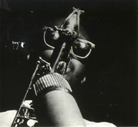
Re: Labels?
Draped and sculpted hep cat suit - as worn by His Royal Hepness, Cab Calloway

#23 2009-09-14 00:51:01
- Taylor McIntyre
- Son of Ivy...
- Posts: 342
Re: Labels?
Brilliant!
Anybody got The Village Squire's label? They were an Anglo inflected Ivy outlet in NYC back in the day.