
You are not logged in.
#2 2014-12-26 13:52:33
- Yuca
- Member
- Posts: 8543
Re: Jazz and the Ivy Look
I'm a Latin jazz fan so you need to relate it to rhythm. I want colour representations of son clave and the 6/8 bell pattern.
some sort of banal legitimacy
#3 2014-12-26 14:02:18
- Bop
- Member
- Posts: 7661
Re: Jazz and the Ivy Look
If you want to understand the fractal nature of rhythm go look at Pollock that is basically what his drip paintings are doing in a very organic way. All rhythm is, is fractals. Intervals being played either half as short or twice as long the musical idea it references.
This is well understood in clothing with our dimensions. But that's another story.
Last edited by Bop (2014-12-26 14:03:07)
#4 2014-12-26 14:08:38
- Armchaired
- Ivy I.V.

- From: Old England
- Posts: 7580
Re: Jazz and the Ivy Look
Personally i think it could do with a little more cowbell.
�Careful with that axe Eugene.�
#7 2014-12-27 01:07:01
- 4F Hepcat
- THE Cat
- Posts: 14333
Re: Jazz and the Ivy Look
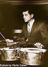
The Ralphy plaids are always interesting and sometimes he gets it spot on - there are other pretenders who have a go, but Ralphy has the mills tied-up producing the multi-coloured patterned stuff for him alone.
Vibe-Rations in Spectra-Sonic-Sound
#8 2014-12-27 01:28:31
- 4F Hepcat
- THE Cat
- Posts: 14333
Re: Jazz and the Ivy Look
In fact, I would go so far to state that those plaids are pure bebop.
Vibe-Rations in Spectra-Sonic-Sound
#9 2014-12-27 01:37:03
- Bop
- Member
- Posts: 7661
Re: Jazz and the Ivy Look
Intrestingly Ralph does use a lot of colour combos that are Dominant chords or mixolydian/blues in style.
Again you can see by that second plaid which has those elements in it.
Suitability the theory that underpins what Im doing is based on the classical Indian method of dividing up the octave. So it seems suitable that madras is used to show the principle.
They set up a division of phi throughout the octave, (in our case the colour spectrum) dividing it up by phi until they were left with 24 intervals.
In indian theory the Sa or home note can be considered the tonic, the Pa is the fifth note and is what we can consider to be a balancing opppsite. In colour theory we dont do this. And we limit ourselves by not using this foundation. This is the 1st fundamental relationship in colour and music IMO
Further intervals are then picked to make the scales which pick up the nuances of mood and emotion.
It's a beautiful thing.
Last edited by Bop (2014-12-27 01:41:26)
#11 2014-12-27 08:30:07
- Worried Man
- Member
- From: Davebrubeckistan
- Posts: 15988
Re: Jazz and the Ivy Look
I find this very interesting as well. It makes complete sense. However, I struggle with color, and I'm not sure how easily I could incorporate it into my daily dress. It's hard enough for me to build a complete outfit with a simple color wheel!!
"We close our sto' at a reasonable hour because we figure anybody who would want one of our suits has got time to stroll over here in the daytime." - VP of George Muse Clothing, Atlanta, 1955
#12 2014-12-27 09:00:42
- Bop
- Member
- Posts: 7661
Re: Jazz and the Ivy Look
Colour is a fuckwit especially with clothes as you normally cant have a massive say on what you get.
With painting or working on the computer you have full control. And who is going to put that much time into an outfit you have to be obsessive? However with a bit of planning you can set yourself up for knowing what is going to work..im on the hunt for an aqua colour oxford because i know its going to go with the colour of my cord jacket because ive mapped it out on an image. Better doing that than wasting time and money on something thats not going to work.
And also you wouldnt go and buy lots of lovely ingredients and just chuck them together..there is nothing wrong with a bit of planning.
I have two pallettes set up for my two jackets because i figure theyre the most expensive item i cant get too many and its one of the largest bits of clothing other the trousers. Then i work the main contrast between those two. And fit the other intervals around it.
#13 2014-12-27 09:07:02
- Worried Man
- Member
- From: Davebrubeckistan
- Posts: 15988
Re: Jazz and the Ivy Look
See... that makes a lot of dang sense.
"We close our sto' at a reasonable hour because we figure anybody who would want one of our suits has got time to stroll over here in the daytime." - VP of George Muse Clothing, Atlanta, 1955
#17 2014-12-27 12:14:39
- Bop
- Member
- Posts: 7661
Re: Jazz and the Ivy Look
Scales without dissonance have no drama like a major scale, but then think of a diminshed scale it is drenched in drama..its such a dissonant relationship of ratios.
I think humans like both peace of mind that consonances brings and the drama of dissonance. No different that music or you could even say story telling.
This is part of a much bigger philosophy that seems to point towards you could say Taoism but that doesnt really do it justice because if you think of this as just opposites it is not sophisticated enough to bring in the relative nature of things.
#24 2015-01-04 11:26:11
- Yuca
- Member
- Posts: 8543
Re: Jazz and the Ivy Look
What scale are they in?
some sort of banal legitimacy
#25 2015-01-04 11:34:16
- Armchaired
- Ivy I.V.
- From: Old England
- Posts: 7580
Re: Jazz and the Ivy Look
They have got to be a pair of high rise octatonics.
�Careful with that axe Eugene.�